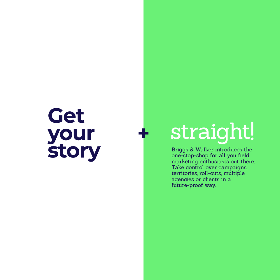
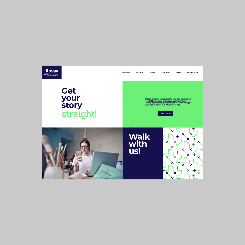
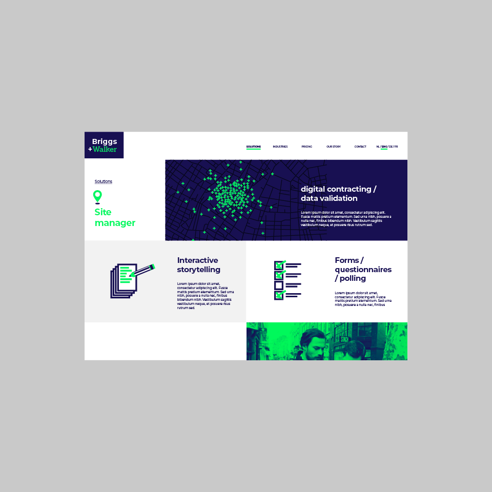
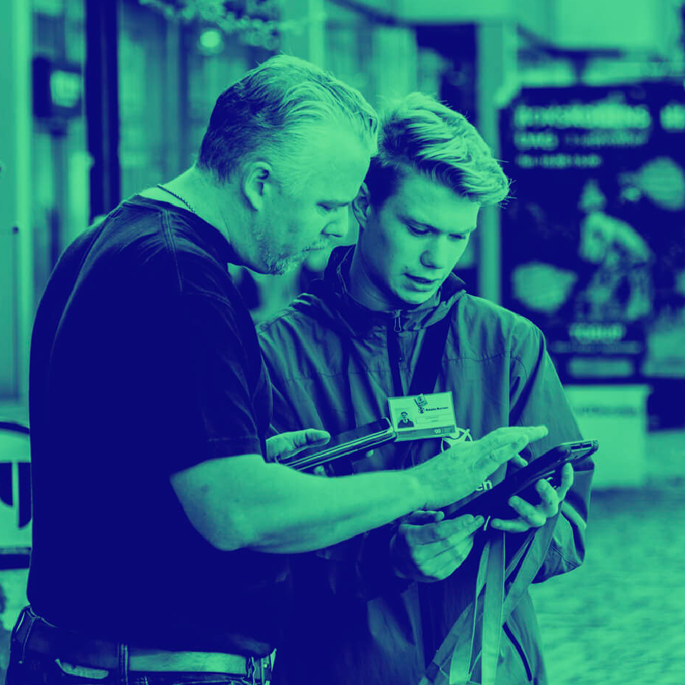
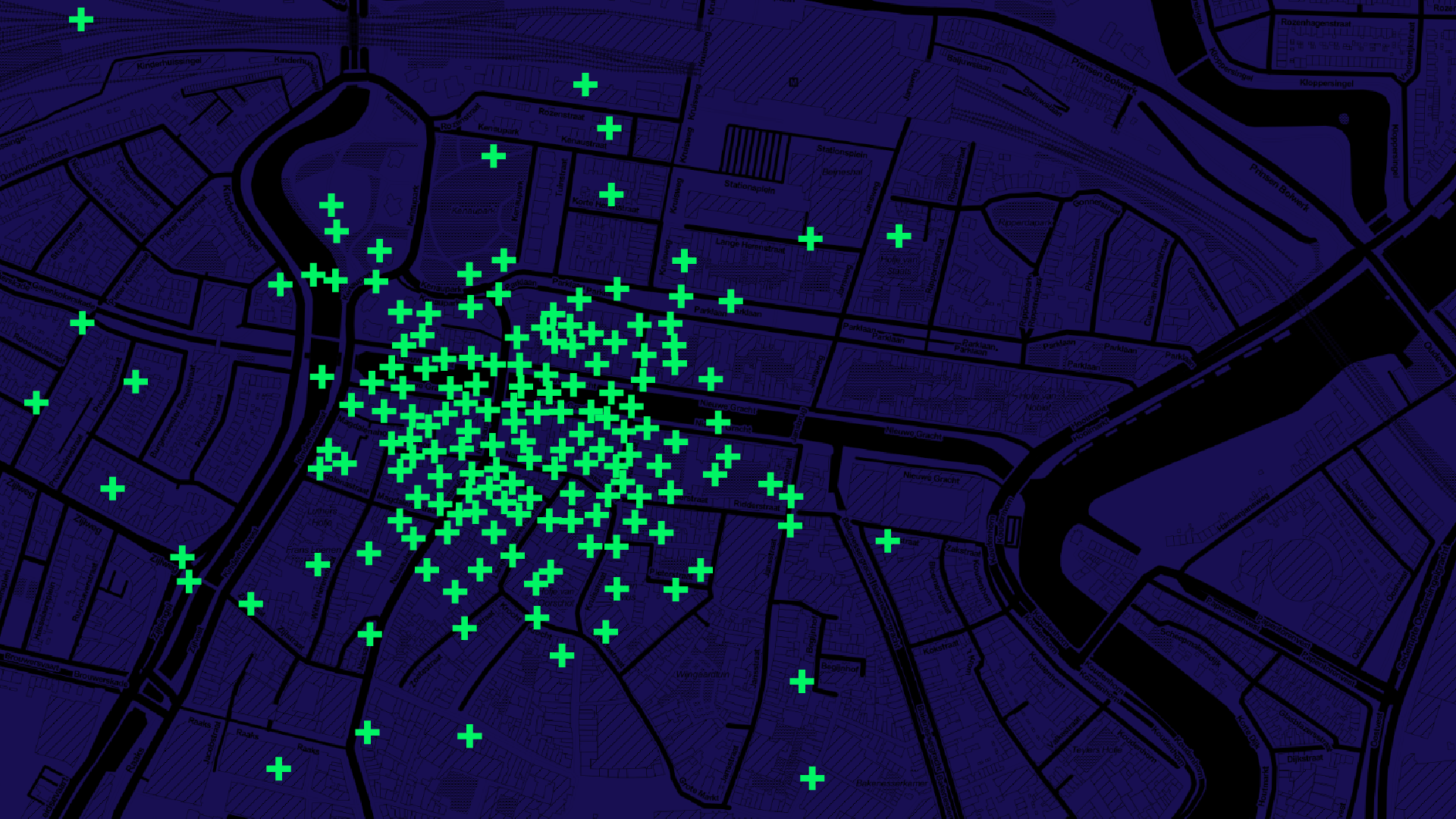
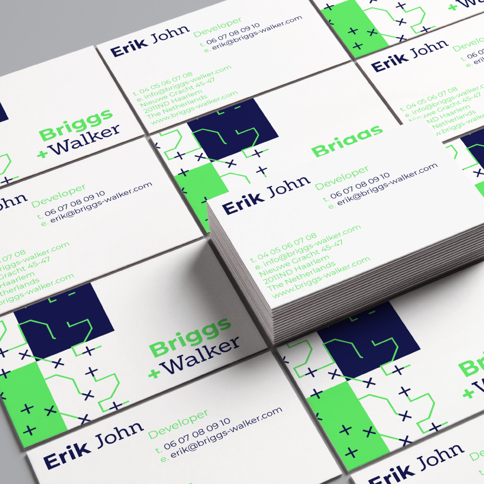
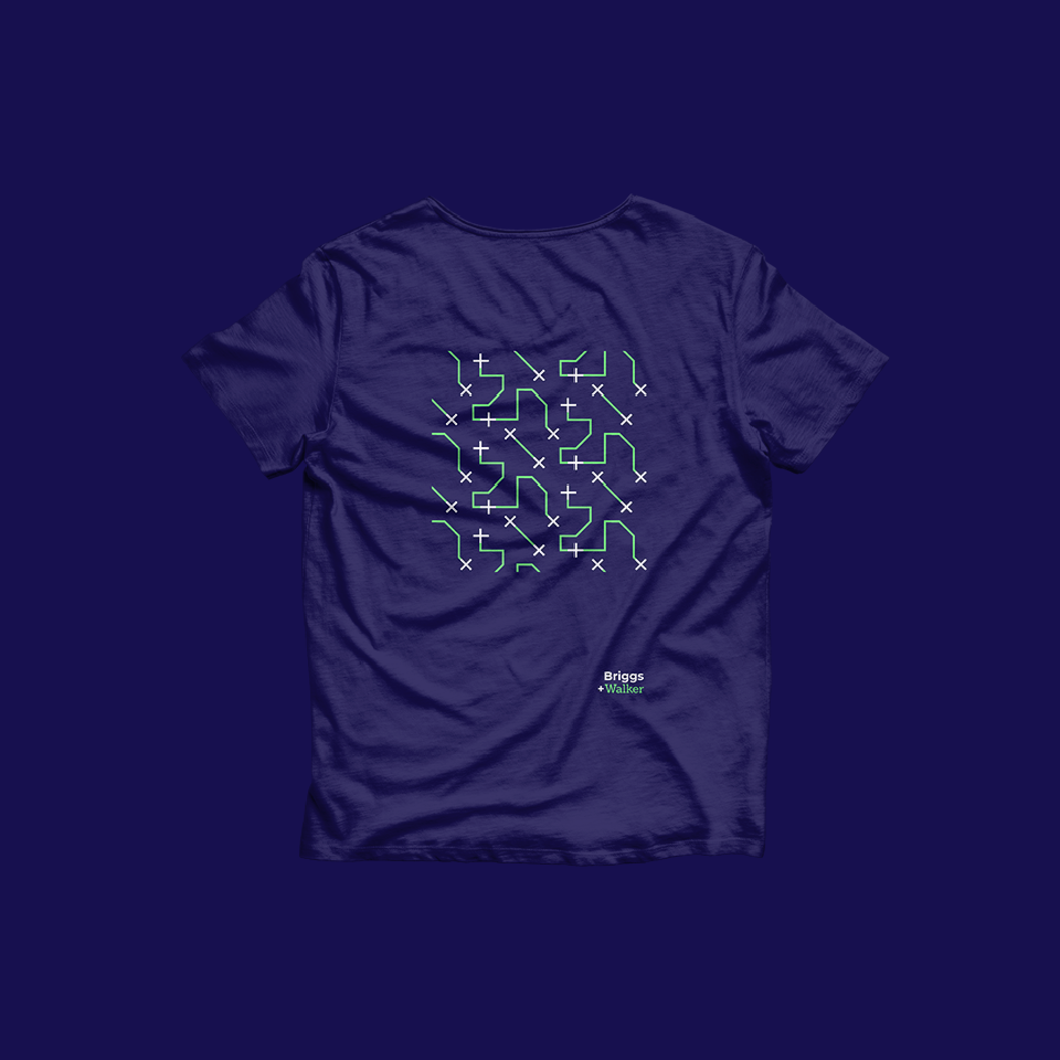
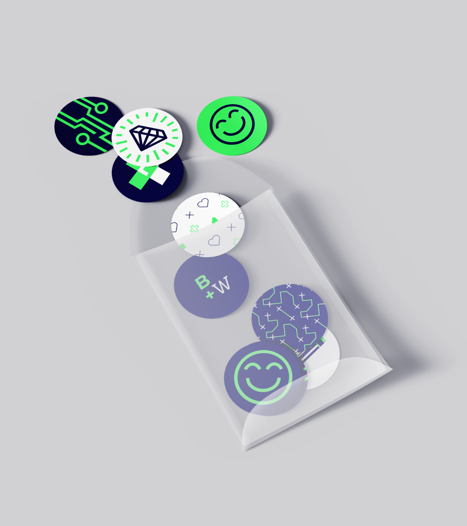
Briggs & Walker, a growing field marketing agency based in Haarlem was in need of a redesign of their brand language to follow up with the fast evolving market. Based on the concept of the two contrasting worlds of Digital vs Physical, where technology/datas works hand-in-hand with field heroes (human), we have developed a brand identity with two different typefaces illustrating two personalities : Mr Briggs & Mr Walker.
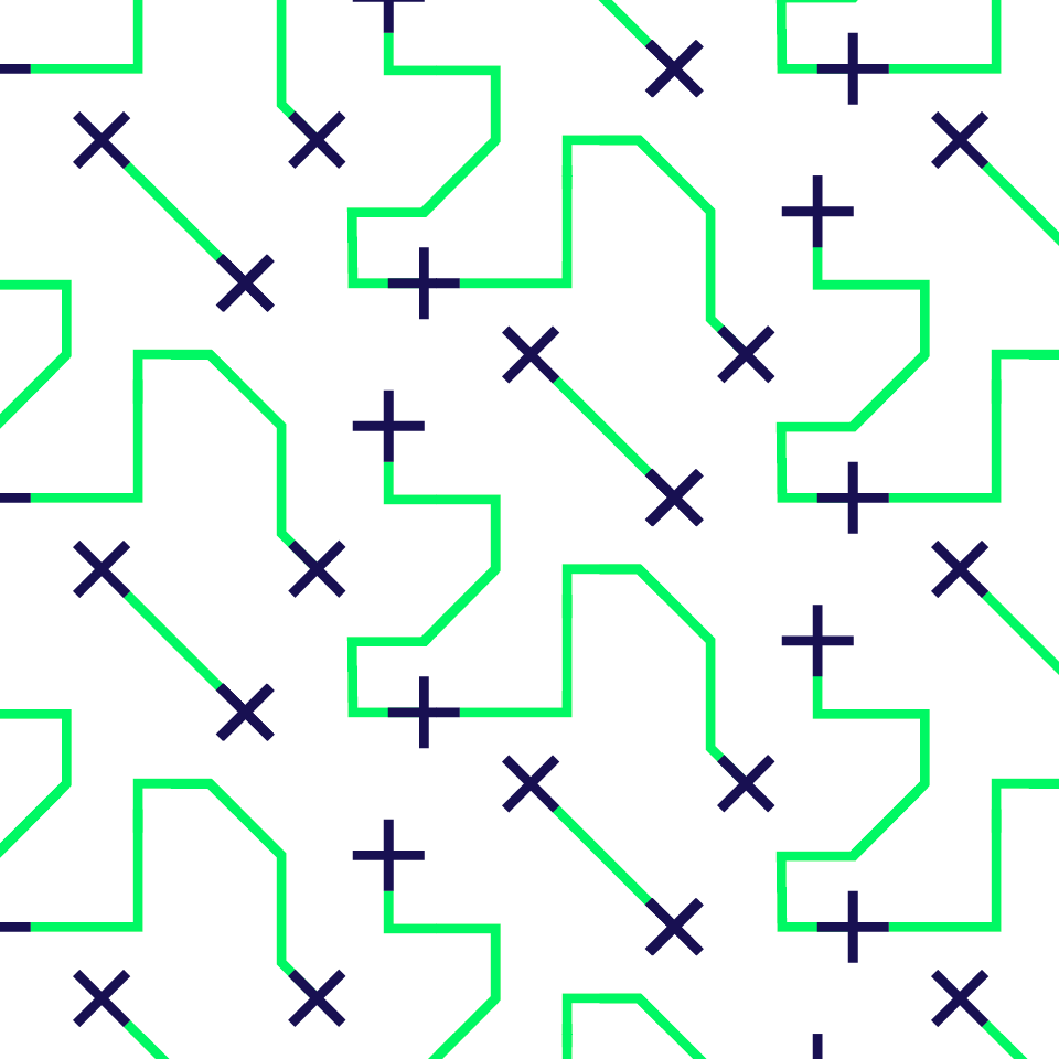
Using sharp and contrasting colours, tech-like patterns representing connections between humans and datas, like a conversation.